We designed a unified icon system to reduce visual inconsistency and cognitive load in warehouse operations. This improved task recognition, sped up decision-making on handheld devices, and made workflows more efficient while creating a more intuitive and scalable interface.
Mercado Libre, one of the largest logistics platforms in Latin America, relies on Fulfillment Centers to move products between sellers and buyers.
In these warehouses, operators use handheld devices for tasks like scanning and moving items, but inconsistent icon styles and weak real-world representation created friction in fast-paced environments.
As a Product Designer on the Design System team, I led the unification of iconography across Mercado Envios. The challenge was to create a consistent, scalable, and highly recognizable system that enabled operators to understand actions quickly with minimal cognitive effort, even in noisy, high-distraction environments.
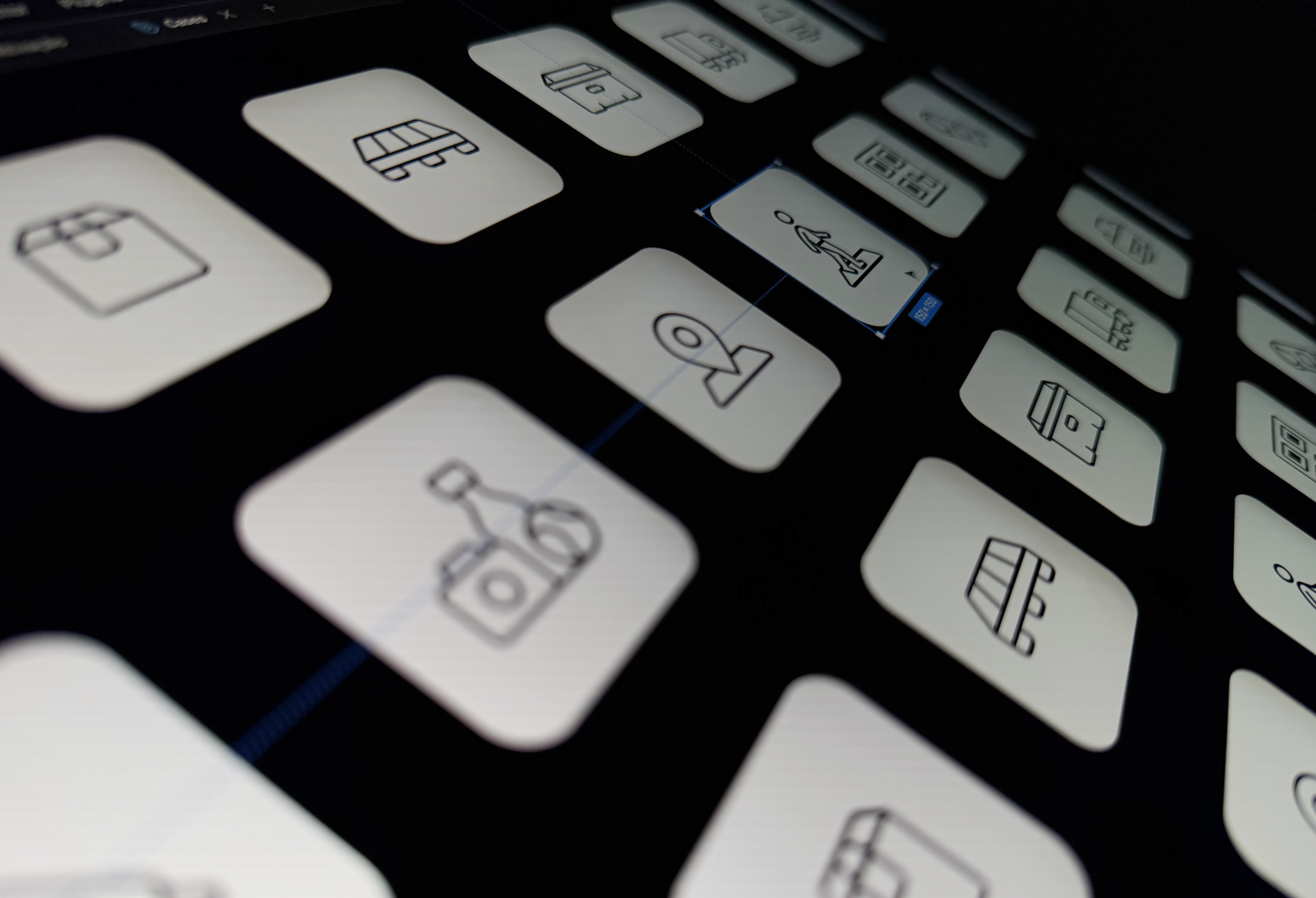
We began by mapping icons and illustrations usage across the entire business unit. To build a complete picture of the problem, we asked designers from different squads to share the assets they were using in their products and workflows. This allowed us to catalogue recurring patterns, identify inconsistencies, and understand which were the most used representations of objects.
From this audit, we found multiple visual variations for the same objects and actions, with conflicting styles, proportions, and levels of detail. By analyzing these assets considering the realities of warehouse environments, where attention is divided between movement, safety, and task execution, we were able to define where the new system should begin.
Since icon design was a new discipline for me, I had to quickly develop this skill while leading the project. A key part of the process was defining the visual direction of the system: should icons be more simplified and abstract, or more literal and descriptive?
Once this foundation was established, we prioritized the most critical icons and refined them through iterative design cycles, balancing clarity, recognizability, and realism.

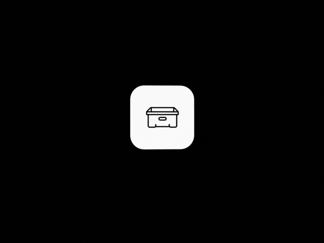
The final system used pictograms inspired by real warehouse objects and was validated and improved through on-site testing with operators, where one important insight emerged: some objects were better understood when represented with perspective and depth rather than flat shapes. Incorporating subtle dimensionality into selected icons became a defining principle of the system, especially for objects where spatial form was essential for recognition.
In collaboration with cross-functional stakeholders we were able to create a cohesive pictogram-based icon system for Mercado Envios. The final solution established a unified and scalable visual language optimized for handheld devices, by combining clear pictograms, selective depth cues, and strong real-world references. This system reduced reliance on text, improved recognition speed, and helped operators complete tasks through intuitive visual cues.

Faster task recognition across interfaces
Reduced cognitive load for warehouse operators
Improved task execution time and operational SLAs
This project reinforced the importance of clarity and consistency in high-pressure environments, showing how a strong visual system can bridge the physical and digital worlds to make workflows more intuitive, efficient and reliable, while improving both user experience and operational performance.


.png)