We introduced a Welcome page to Loft’s payments platform to make it easier for real estate agencies to get started. By offering clear step-by-steps and better explanations, we improved user understanding, increased conversions, and helped real estate agencies to fully adopt our product.
In the fast-paced world of real estate, Loft stands out as a digital platform simplifying the buying, selling, and financing of residential properties.
With a focus on transparency, speed, and reliability, Loft has quickly grown into one of Latin America's leading proptech companies.
Expanding beyond its marketplace, Loft introduced a Payments platform aimed at empowering smaller real estate agencies — such as one-person operations or family-run businesses — to embrace the digital world and enhance their performance.
Loft’s Payments platform offers robust features like automatic payment splitting and rent collection via popular Brazilian payment methods, such as bank slip and Pix. However, many users face challenges when getting started.
User research, including interviews and surveys, revealed that our users were confused about how Payments fit into Loft’s broader ecosystem and how it compared to competitors in terms of costs and features.
These insights emphasized the need for a more intuitive experience that would simplify navigating through the platform and clearly communicate how it works from the start.

To address these challenges, we gathered data from real estate agencies through a combination of qualitative and quantitative research. We began by collecting experience metrics such as CSAT and NPS to identify pain points and understand overall satisfaction with the platform.
To gain deeper insights, we conducted interviews with users which helped us understand their needs, behaviors, and frustrations. These combined research methods provided a comprehensive view of the problems we had and the opportunities for improvement.
Once we understood our users' needs and pain points, we jumped into the design phase. We created low-fidelity screens to make sure navigation was simple and all the key informations were easy to find.
Each section was designed to better showcase the platform's features, explain its costs, and guide users toward signing up and getting started. We tested these screens with our real estate users, iterating the design based on their feedback, focusing on making the experience clear and simple.
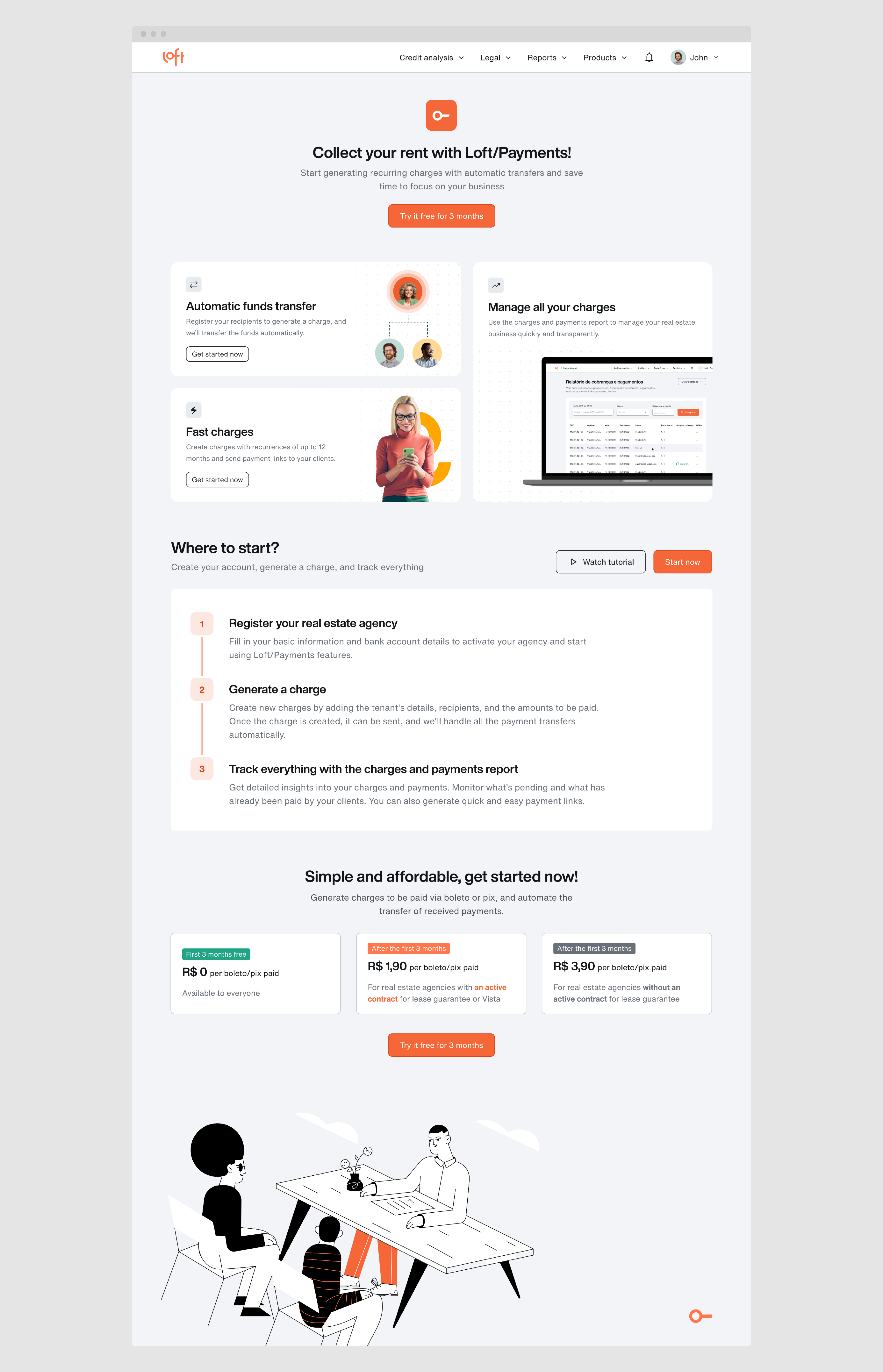
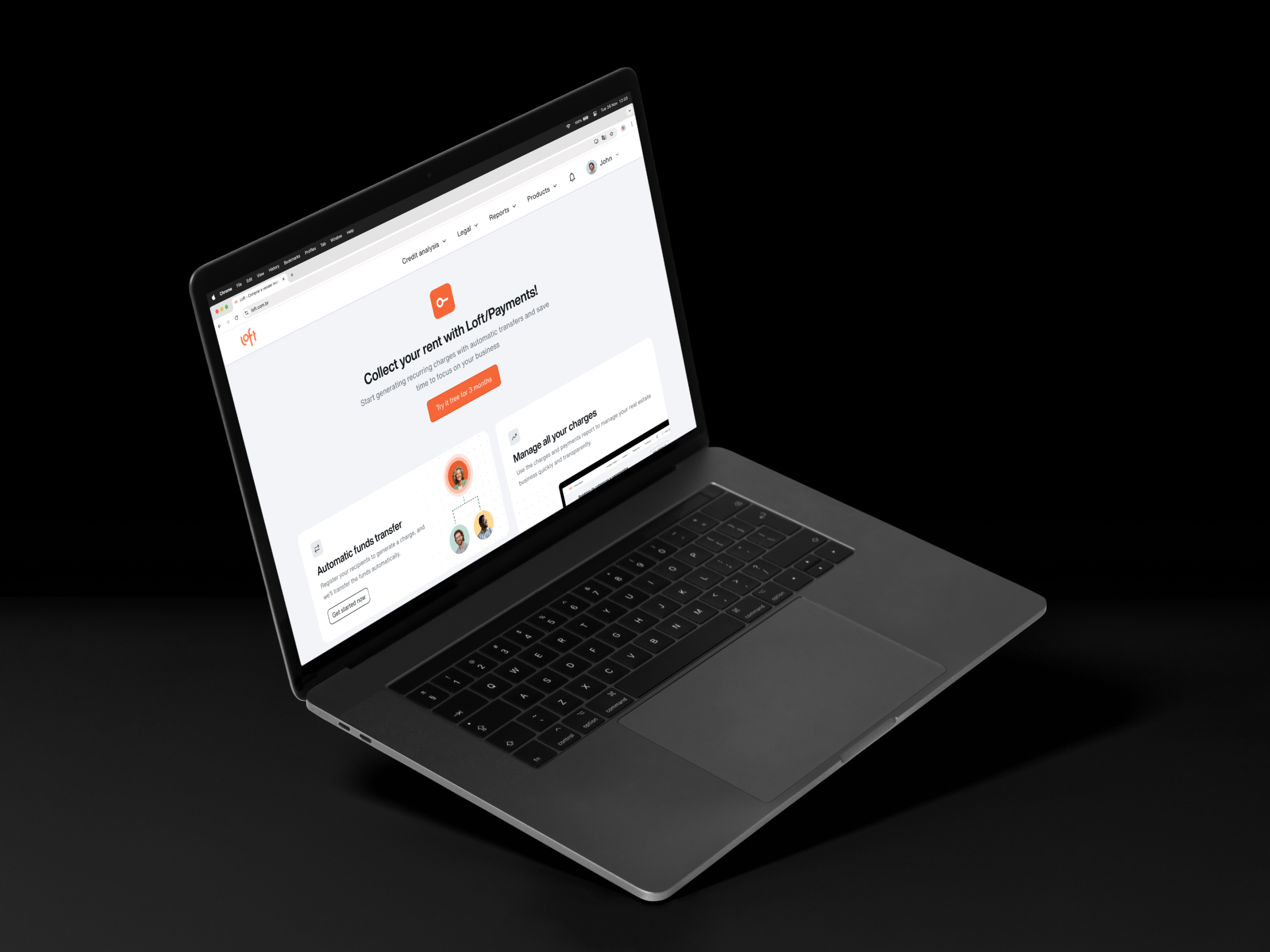
The final design of the Welcome page gives new users a simple yet engaging start.
It walks them through the registration process all the way to their first transaction with a clear, step-by-step tutorial. We added short, engaging explainer videos to show how to register, create charges, manage tenants, and send checkout links.
We also included a section that clearly breaks down the platform's costs, featuring an offer to try it free for 3 months, to attract new users. To simplify the sign-up process, we strategically placed CTAs throughout the page, ensuring users can easily take action and get started whenever they're ready.

2x higher conversion to first payment among new users
Organic growth, bringing higher quality leads
As a result, our conversion to first payments increased significantly, indicating that the new onboarding effectively enhanced user engagement, improved understanding of the platform and its features, and strengthened activation.